Two-tone-painted-kitchens can feel current without relying on a single formula. Some pair dark base cabinets with light uppers for a grounded, familiar balance; others put color on the island, separate cabinetry into distinct zones, or reverse the expected light-over-dark arrangement. Across these kitchens, wood, stone-look surfaces, tile, metal hardware, and soft furnishings help connect the cabinet colors into a cohesive room. The examples below show how contrast can be crisp, quiet, rustic, graphic, or tailored while still leaving the kitchen feeling considered.
1. Ground a Bright Kitchen With Navy and Oak
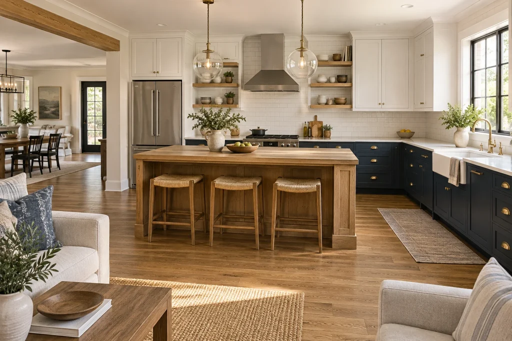
This kitchen uses a dark-to-light composition that feels settled rather than stark: deep navy cabinetry runs along the base cabinets, while creamy white upper cabinets lift the eye around the range wall. The oak island is the visual bridge between them. Its substantial frame, wood top, and three woven-seat stools introduce a softer, more furniture-like note at the center of the room. Brass pulls, cup pulls, faucet hardware, and pendant details repeat a warm metallic accent without interrupting the restrained palette. White subway tile and pale counters keep the backdrop quiet, while open wood shelves near the hood echo the island’s finish. Beyond the kitchen, the same wood flooring continues into the adjoining sitting and dining areas, helping the darker cabinet color read as part of a larger, cohesive space.
Why it works: The pale uppers preserve brightness at eye level, while the navy lowers give the perimeter definition. Oak and brass prevent the high-contrast paint pairing from feeling cold.
- Deep navy base cabinetry
- Creamy white shaker-style uppers
- Oak island with a wood top
- Brass hardware and faucet
- Clear glass globe pendants
Design tip: Repeat the island wood tone on one or two open shelves for a more connected two-tone scheme.
2. Let Matte Black Define an Industrial Kitchen
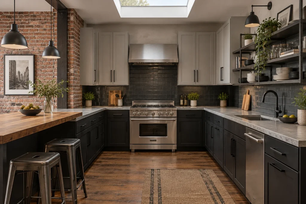
For a more urban take on two-tone-painted-kitchens, this U-shaped kitchen places matte black on the lower cabinets and a muted warm gray on the tall upper cabinetry. The change in value is deliberate: black grounds the work surfaces and frames the stainless range, while the gray cabinets soften the upper half against the brick wall and concrete-toned counters. A black tile backsplash extends behind the range and beneath the open shelving, creating a continuous dark band rather than a series of disconnected finishes. Metal shelf supports, black pulls, a black faucet, and dark pendant shades keep the hardware language consistent. The butcher-block bar at left is especially effective here; its warm grain offsets the hard-edged mix of brick, steel, black tile, and metal stools.
Why it works: The upper cabinets are lighter than the lowers but not bright white, so the contrast stays moody and suited to the brick-and-metal setting. Warm wood keeps the finish mix from becoming overly severe.
- Matte black lower cabinets
- Soft gray upper cabinets
- Black tile backsplash
- Exposed brick wall
- Wood breakfast bar with metal stools
Design tip: When pairing black lowers with gray uppers, use black hardware on both to make the cabinet colors feel intentional.
3. Make the Island the Painted Statement
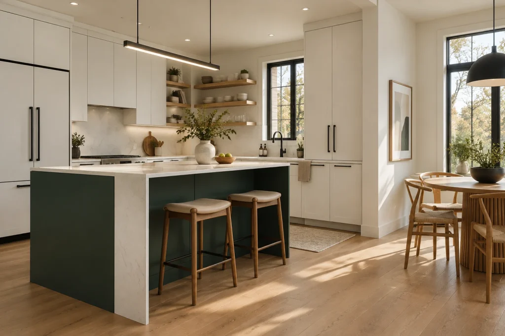
This room reverses the usual two-tone hierarchy by concentrating color on the island instead of the perimeter. The forest-green base sits beneath a pale waterfall counter, making the island read as a clean-lined focal point from both the kitchen and dining area. Surrounding cabinetry is warm white and largely flat-fronted, allowing the green to hold attention without competing door profiles. Matte black appears in the long linear island light, cabinet pulls, window frames, and faucet, giving the pale-and-green scheme graphic definition. Light ash-toned flooring, wood stools, and a round wood dining table add a natural counterpoint to the crisp cabinetry. Open wood shelves tucked beside the range supply another small note of warmth, while the large windows bring daylight across the dining side of the room.
Why it works: Keeping the perimeter light visually enlarges the room, while one saturated island creates contrast at furniture scale. The waterfall edge makes the dark paint block feel especially deliberate and contained.
- Forest-green island base
- Pale waterfall countertop
- Warm white flat-panel cabinetry
- Matte black lighting and hardware
- Light wood stools and dining furniture
Design tip: Use a colored island when you want two-tone contrast without committing every lower cabinet to a darker shade.
4. Pair Sky Blue Cabinets With a Soft Banquette
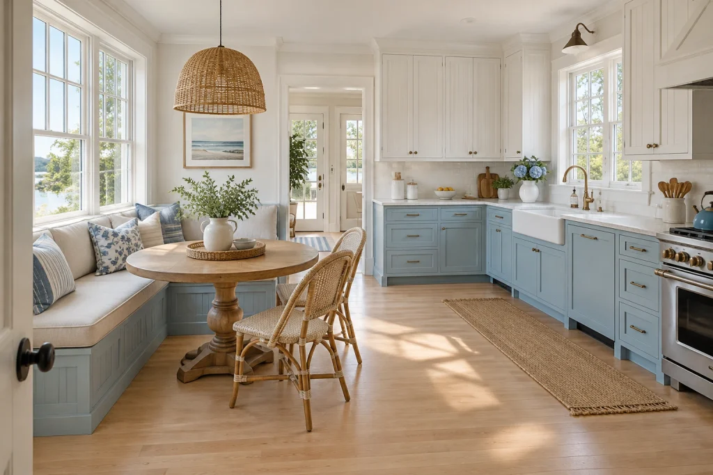
Here, soft sky-blue lower cabinets bring color around the room while white upper cabinets maintain an airy backdrop. The blue extends to the base of the window-side banquette, tying the dining nook directly to the cabinetry rather than treating it as separate furniture. Linen-colored upholstery and blue-and-white pillows soften the built-in seat, while the round pedestal table and woven dining chairs introduce warm natural texture. Above, the white upper cabinets have vertically detailed fronts that add cottage character without adding another color. Brass-toned pulls, a brass faucet, and the range knobs provide a warm gleam against the blue and white. Large windows on both sides brighten the pale wood floor, and the oversized woven pendant reinforces the relaxed, coastal-leaning material mix.
Why it works: Matching the banquette base to the lower cabinets makes the colored portion of the room feel continuous. White uppers, pale counters, and generous window area keep the blue from visually weighing down the kitchen.
- Sky-blue lower cabinets
- White vertically detailed upper cabinets
- Built-in upholstered banquette
- Round wood pedestal table
- Woven pendant and dining chairs
Design tip: Carry the lower-cabinet color onto a built-in bench base to make an eat-in kitchen feel more unified.
1. Ground Terracotta Cabinets With Cream Uppers
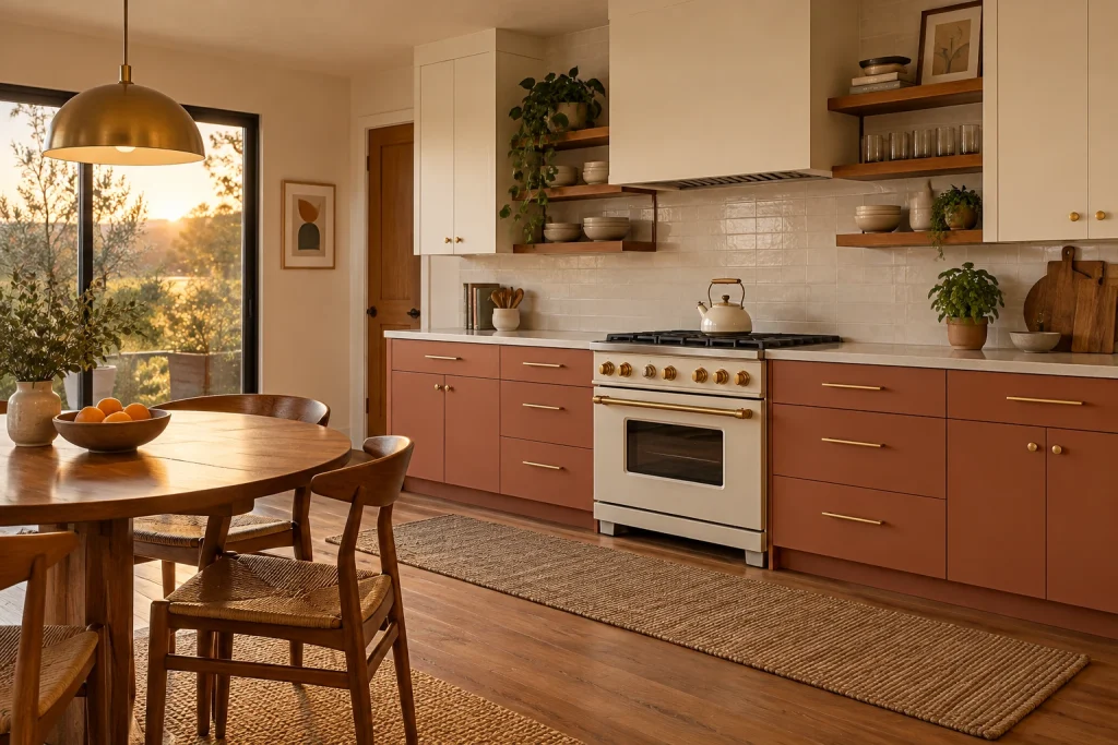
Among two-tone-painted-kitchens, this pairing feels especially composed because the color is distributed by visual weight. Terracotta base cabinets run across the kitchen wall, while warm cream wall cabinets keep the upper half quiet and bright. The cream vintage-style range joins the lighter cabinetry rather than interrupting the color scheme, and its brass-toned knobs and rail echo the slim brass pulls below. Teak open shelves break up the closed cabinetry with a deeper wood note, holding bowls, glasses, books, framed art, and trailing plants. A white tile backsplash and pale countertop create a clean buffer between the painted sections. In the foreground, the round wood dining table, wood chairs, woven seats, and large brass pendant make the kitchen colors feel connected to the adjacent dining area.
Why it works: The deeper tone stays below the counter line, giving the long cabinet run definition without making the wall feel heavy. Cream, tile, wood, and brass keep terracotta from reading flat or overly rustic.
- Terracotta lower cabinets
- Warm cream upper cabinets and range
- Slim brass cabinet hardware
- Teak open shelving
- White rectangular tile backsplash
Design tip: Repeat the lower-cabinet color in only one or two small accents, then let light uppers carry the wall.
2. Use Charcoal and White to Sharpen a Galley Kitchen
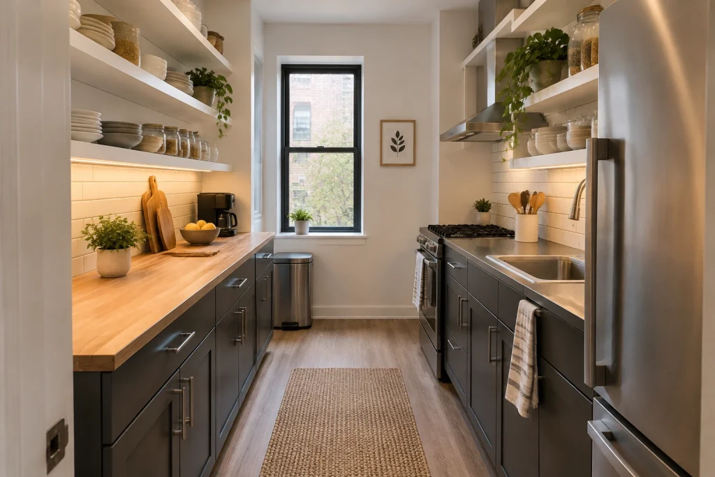
This narrow kitchen uses a crisp, high-contrast version of two-tone-painted-kitchens: charcoal cabinetry anchors both sides at counter height, while open white shelves take the place of visually heavier upper cabinets. The dark lower fronts are fitted with long, squared chrome pulls, which relate to the stainless refrigerator, sink, faucet, range, hood, and trash can. On the left, the warm wood counter adds relief between the charcoal base and white shelving. White subway tile continues behind both work areas, with under-shelf lighting creating an even band of illumination along the backsplash. The shelves are stocked in restrained groups—white and gray dishes, clear pantry jars, a few plants, and glassware—so the open storage stays orderly. A single black-framed window at the end gives the long room a clear focal point.
Why it works: Dark bases establish a strong horizontal line, while white shelving preserves visible wall space. The repeated metal finishes and pale backsplash keep the two cabinet treatments looking intentional rather than mismatched.
- Charcoal lower cabinetry
- Open white wall shelves
- Wood countertop
- White subway-tile backsplash
- Chrome and stainless-steel details
Design tip: For open shelving, limit the display to repeatable categories such as dishes, clear jars, and a few plants.
3. Give Each Cabinet Color Its Own Zone
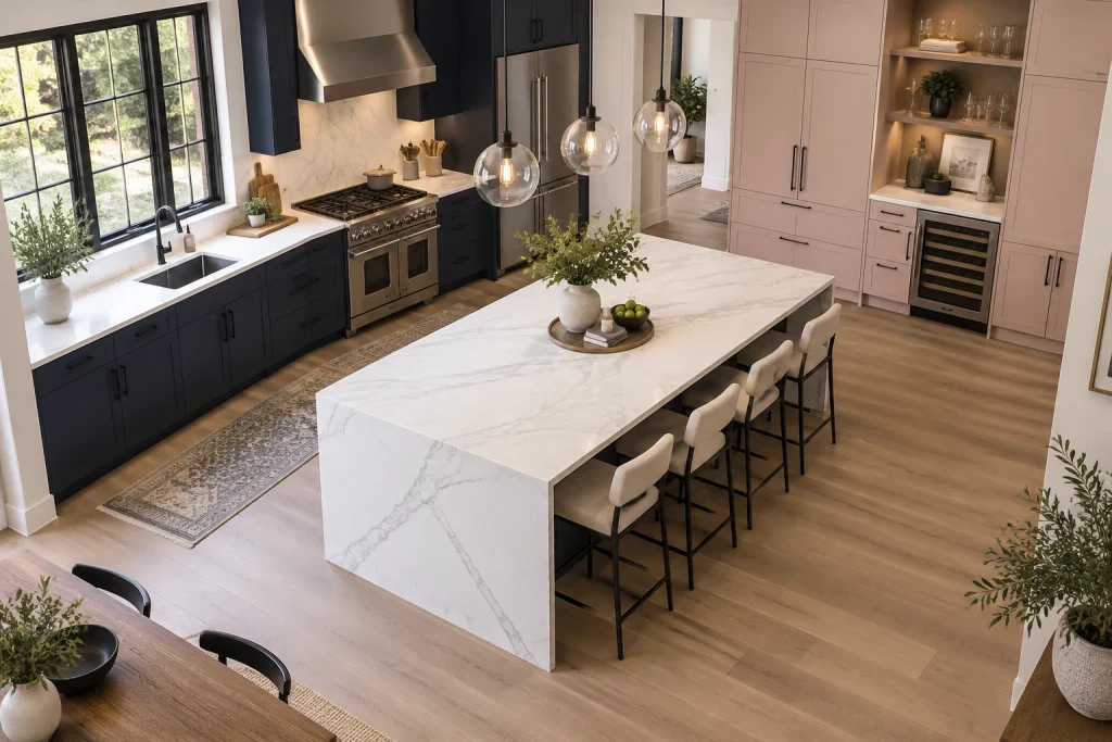
Rather than splitting color strictly between upper and lower cabinets, this kitchen uses paint to distinguish two visible areas. Navy cabinetry frames the sink, range, refrigerator, and vent hood on the left, creating a concentrated prep-side backdrop. Across the room, soft blush cabinetry forms a tall storage wall, where black pulls, open display niches, and a glass-front wine refrigerator add contrast and detail. Between them, the large waterfall island is finished in white marble-look stone with gray veining. Four upholstered stools line its long side, while three clear globe pendants hang overhead. The island’s pale surface links to the perimeter counter and backsplash, allowing the navy and blush to remain distinct without competing. Black window frames and dark hardware repeat across the room to tie the two painted zones together.
Why it works: The palette assigns a clear identity to each cabinetry wall, while the light island acts as neutral space between them. Repeating black accents provides a consistent outline for both colors.
- Navy prep-side cabinetry
- Soft blush storage wall
- White veined waterfall island
- Black cabinet pulls and window frames
- Glass-front wine refrigerator
Design tip: When pairing two cabinet colors on separate walls, repeat one hardware finish across both zones.
4. Pair Black Bases With Glossy White Above
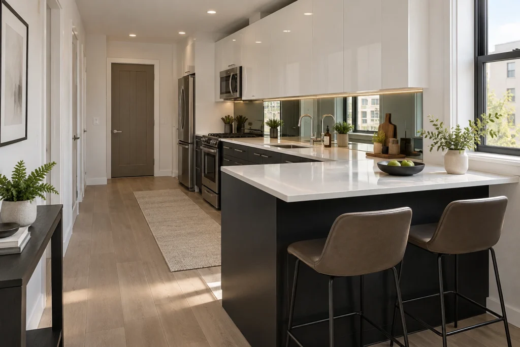
Here, the two-tone strategy is deliberately graphic: matte-looking black lower cabinetry defines the perimeter and peninsula, while glossy white upper cabinets create an uninterrupted reflective band above. The white doors extend nearly to the ceiling and have no visible pulls, giving the upper wall a seamless appearance. Beneath them, a mirrored backsplash reflects the sink, faucet, plants, window, and apartment buildings beyond, adding depth along the narrow work wall. A slim under-cabinet light strip traces the mirror, while a pale countertop softens the shift from black cabinet fronts to reflective glass. The peninsula repeats the black-and-white arrangement and includes two upholstered counter stools. Stainless appliances, a chrome faucet, and a black-framed window reinforce the clean, restrained material palette without adding another competing color.
Why it works: Black concentrates visual weight below the counter, and the glossy white uppers bounce available light across the wall. The mirrored backsplash further reduces the sense of a solid boundary behind the counter.
- Black lower cabinetry and peninsula
- Glossy white handle-free uppers
- Mirrored backsplash
- Pale countertop
- Stainless-steel appliances
Design tip: Keep the counter palette restrained when using a mirrored backsplash so reflections remain clear rather than cluttered.
1. Ground Sage Uppers With Textured Wood
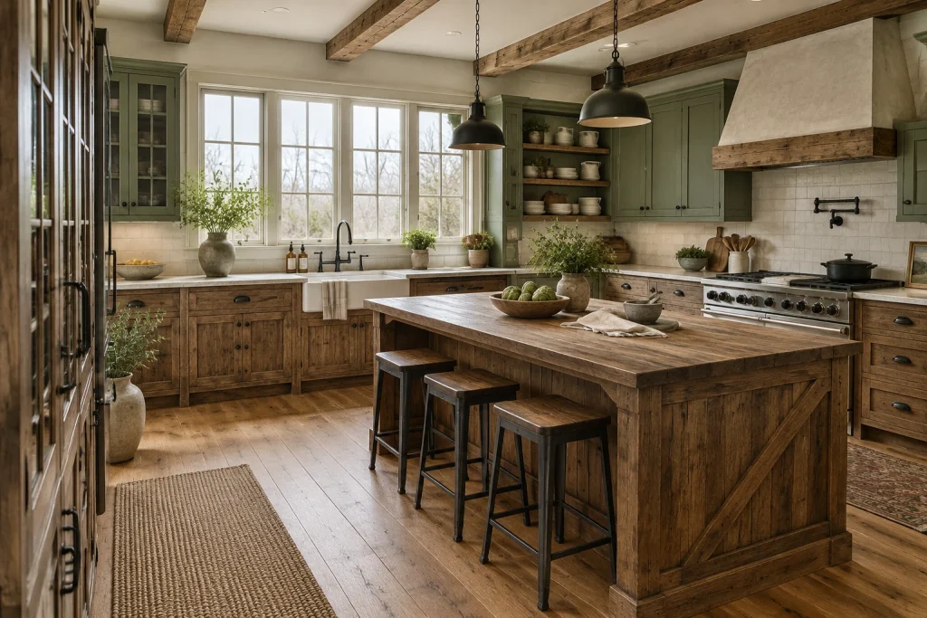
This two-tone-painted-kitchens approach lets the painted color sit above a substantial layer of stained wood rather than asking one finish to do everything. Sage-green upper cabinetry frames the window wall and continues around open shelves, where pale dishes and stoneware keep the color from feeling heavy. Below, deeply grained wood cabinet fronts, a paneled island base, ceiling beams, and wide-plank flooring create a unified rustic foundation. The white apron-front sink, pale countertop, and softly variegated white tile backsplash provide needed relief between the two finishes. Matte-black cup pulls, faucet hardware, pot-filler hardware, and pendant lights sharpen the palette without introducing a competing color. The result is warm and visibly hardworking, with each material given a clear role.
Why it works: The darker, more tactile wood is concentrated at the working level, while the muted green lifts the eye toward the windows, beams, and upper storage.
- Sage-green upper cabinets
- Stained wood lower cabinets and island
- White apron-front sink
- White tile backsplash
- Matte-black pendants and hardware
Design tip: Use one dark hardware finish across cabinets, lighting, and the sink wall to connect painted and wood cabinetry.
2. Make a Dark Upper Band Feel Deliberate
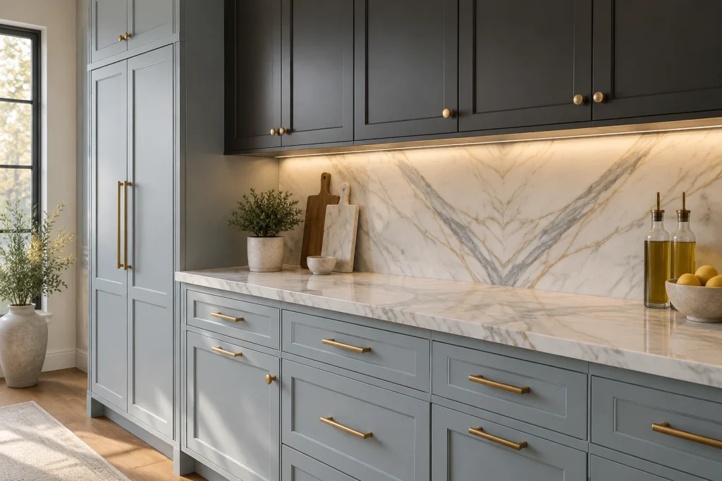
Here, charcoal upper cabinets form a clean, continuous band over pale-blue lower cabinetry, reversing the more familiar light-over-dark kitchen scheme. The contrast is crisp, but the materials soften it: the blue-gray paint has a quiet, low-contrast quality, while warm brass knobs, pulls, and tall pantry handles repeat a golden accent from end to end. A white marble counter and full-height backsplash become the visual bridge, carrying gray and warm beige veining between the two cabinet colors. At the center, the stone’s mirrored veining creates a striking V-shaped composition, so the countertop is kept largely open. The full-height pale-blue cabinet beside the window extends the lower color vertically, preventing the charcoal uppers from reading as an isolated stripe.
Why it works: The dark upper cabinets give the wall definition, while pale-blue bases and continuous marble keep the composition bright and refined.
- Charcoal upper cabinets
- Pale-blue lower cabinets and tall pantry
- White marble counter and backsplash
- Mirrored marble veining
- Aged-brass hardware
Design tip: If you use dark uppers, continue the lighter cabinet color into one tall element to balance the wall vertically.
Final thoughts
The most successful two-tone-painted-kitchens give each color a clear role. A darker finish can anchor the work zone, a lighter one can open the upper wall, or a painted island can provide a focused point of contrast. Repeated details—such as wood tones, backsplash veining, hardware finishes, or upholstery—make the transition between cabinet colors feel intentional. Whether the palette is navy and cream, terracotta and warm white, sage and stained wood, or black and glossy white, the result depends on balancing color placement with the materials around it.