A color-block backsplash kitchen brings structure and personality to a hardworking wall. Instead of relying on one continuous tile finish, this approach uses distinct bands, panels, stripes, checkerboards, or tonal shifts to draw attention to a specific zone. A deep navy field can anchor a range, a quiet sage panel can frame a window, and warm coral or terracotta can turn a recessed nook into a focal point. The most cohesive designs repeat a backsplash color or material elsewhere in the room—through cabinetry, shelving, hardware, lighting, or textiles—while leaving enough pale surface around it for balance. Whether the goal is a bold mid-century composition or a low-contrast gray arrangement, the key is to align the color breaks with architectural lines such as counters, hoods, shelves, windows, and cabinet edges.
1. Ground a Range Wall With a Deep Navy Band
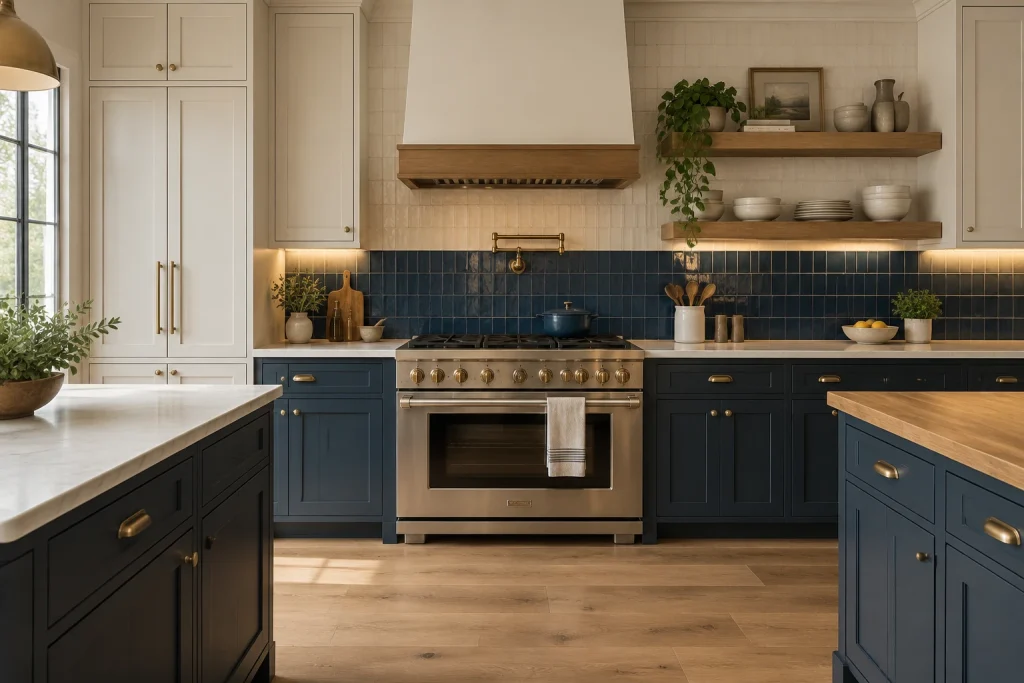
A horizontal split gives this range wall a strong, tailored focal point. Glossy deep navy square tile runs across the lower backsplash, lining up visually with the dark blue base cabinets, while a warm cream tile field continues above it to the large white hood. The change in color occurs beneath the brass pot filler, so the fixture reads as a crisp bridge between the two surfaces. Brass range controls, pulls, and shelf lighting carry that warm metallic note throughout. Pale countertops, tall off-white cabinets, and the open oak shelves keep the dark band from making the wall feel heavy. This color-block-backsplash-kitchen approach is especially effective when the lower shade also appears on cabinetry.
Why it works: The darker tile anchors the appliance zone, while the lighter upper field preserves contrast around the hood and keeps the elevation bright.
- Deep navy glossy square tile
- Cream upper tile field
- Brass pot filler and hardware
- White hood with wood trim
- Oak floating shelves
Design tip: Set the color break at a deliberate horizontal line, such as the underside of a key fixture or shelf.
2. Frame the Sink With a Quiet Sage Panel
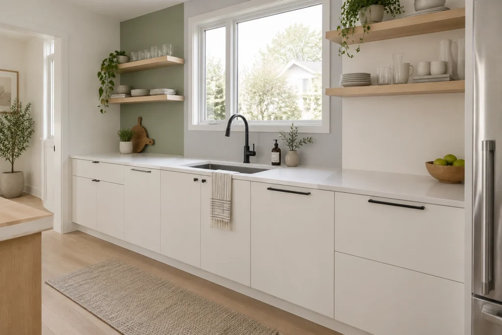
For a softer take on color blocking, this sink wall uses a tall muted-sage panel at the left side of a large white-trimmed window. The green surface is held in a clean rectangle behind two slim pale-wood shelves, making it feel architectural rather than decorative. The area beneath the window and to the right remains a light dove gray, creating a restrained contrast that suits the white flat-front cabinetry and white counter. A matte black gooseneck faucet and long black drawer pulls add definition without competing with the palette. Clear glasses, white dishes, and a few plants keep the shelves airy, allowing the sage field to do the visual work.
Why it works: One contained colored panel brings depth to a largely white run, while the window and pale surrounding surfaces maintain a light, minimal composition.
- Muted sage vertical panel
- Large white-trimmed window
- Pale wood open shelves
- Matte black faucet
- White flat-front cabinets
Design tip: Use one muted color beside, rather than across, a window to give the opening a clean frame.
3. Build a Graphic Backdrop With Wide Primary Blocks
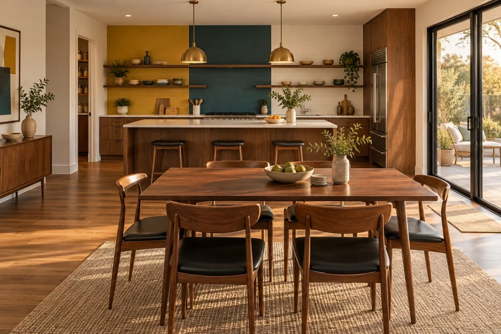
This open kitchen turns the backsplash wall into a broad mid-century-style composition. Mustard yellow tile fills the left section, deep teal occupies the center behind the range, and white tile finishes the right section. The blocks are wide and rectilinear, with their edges aligned to the shelf arrangement and cabinet boundaries rather than treated as random patches. Long walnut shelves stretch across the colors, visually linking the separate fields and echoing the walnut cabinetry, island base, dining table, and chairs. Brass dome pendants introduce another warm note above the pale island counter. Because the shelves display mostly low-profile bowls, books, and small greenery, the large color shapes remain legible from the dining area.
Why it works: The repeated horizontal shelves unite three contrasting fields, and the warm wood makes the mustard and teal feel cohesive rather than overly sharp.
- Mustard yellow tile block
- Deep teal central tile block
- White tile block
- Continuous walnut shelves
- Brass dome pendants
Design tip: For three-color blocking, repeat one grounding finish—here, walnut—across the wall and nearby furniture.
4. Add Depth to a Pantry Nook With a Coral-to-Terracotta Fade
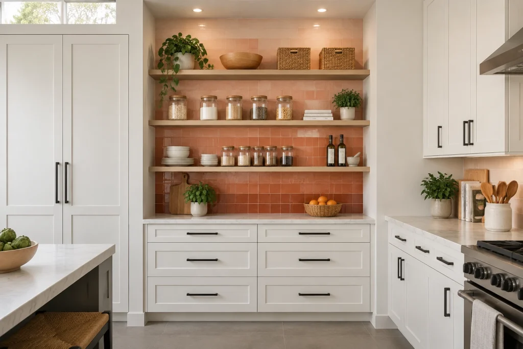
A recessed storage nook becomes the visual center of this white kitchen through glossy tile that shifts from pale coral at the top to richer terracotta near the counter. The tonal transition is gradual, so the backdrop has more movement than a single solid color while staying calm enough for open shelving. Three wood shelves cut clean horizontal lines across the tile and hold glass pantry jars, stacked white dishes, baskets, bottles, cookbooks, and plants. The adjacent white shaker cabinetry and pale marble-look counters sharpen the contrast, while black pulls provide a small graphic accent. Under-shelf lighting and the two recessed lights above the nook bring out the tile’s reflective variation.
Why it works: The darker lower tile gives the niche visual weight, and the lighter upper tones keep the recessed area from reading as a dark opening.
- Coral-to-terracotta glossy tile
- Recessed open pantry nook
- Natural wood shelves
- White shaker cabinetry
- Glass storage jars
Design tip: Place the deepest shade closest to the counter to visually ground an ombré backsplash.
1. Use Horizontal Bands to Settle a Long Galley Kitchen
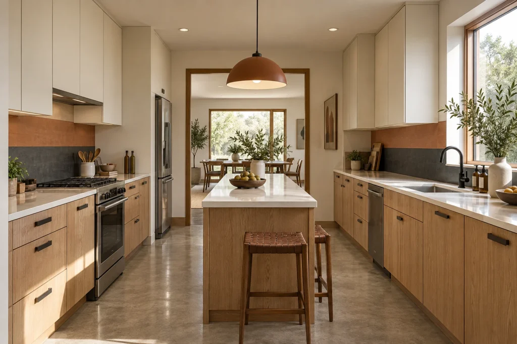
A horizontal color-block backsplash gives this galley kitchen a strong, calming line without competing with the cabinetry. The wall is organized in three broad fields: a dark charcoal band at counter level, a warm clay band above it, and a light cream upper section. The sequence feels especially cohesive beside pale upper cabinets, natural oak lower cabinets, and light countertops. Rather than reading as a small decorative insert, the color extends continuously along both sides of the room, linking the range wall to the sink wall. A clay pendant above the central wood island repeats the backsplash’s warm middle tone, while the black faucet, hardware, and appliances pick up the charcoal band. It is a useful color-block-backsplash-kitchen approach when a narrow room needs definition but not visual clutter.
Why it works: The darkest color is placed closest to the work surface, visually grounding the cabinetry, while the lighter upper field keeps the room bright around the large window.
- Charcoal counter-height backsplash band
- Warm clay middle band
- Cream upper wall field
- Natural oak lower cabinets
- Clay pendant and woven-leather stools
Design tip: Keep each band level and continuous across adjoining backsplash runs for a more intentional result.
2. Frame Offset Tile Blocks With Black Steel
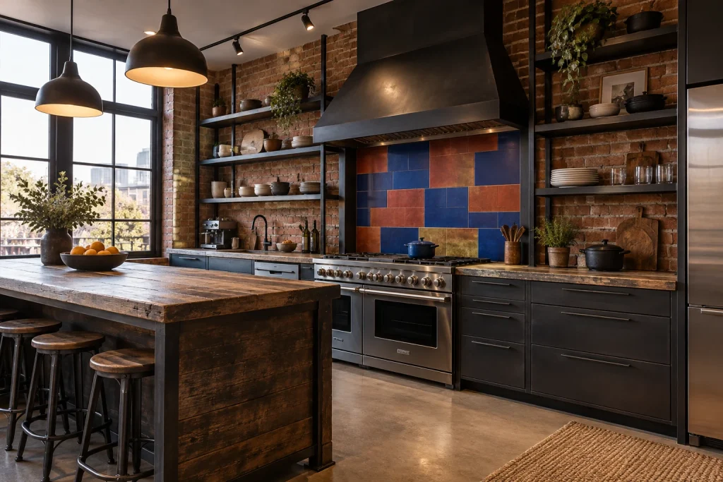
This kitchen treats the range wall as a graphic composition. Rectangular tiles in deep cobalt blue and brick red are arranged in an offset grid behind the range, with a small muted gold tile at the lower edge. The backsplash sits inside a substantial matte-black surround: a broad steel hood above and slim vertical supports at either side. That dark frame contains the bold color so it does not overwhelm the exposed brick wall or the open black shelving that flanks it. Reclaimed-looking wood counters and the large wood-topped island bring a rougher, warmer texture against the tile’s clean geometry. Black pendant shades, shelving, and lower cabinets repeat the frame color, making the varied backsplash blocks feel deliberate rather than random.
Why it works: The steel surround creates a clear boundary around the brightest colors, while the offset tile layout adds movement to a wall already rich in brick texture.
- Cobalt and brick-red rectangular tiles
- Single muted gold accent tile
- Matte-black range hood
- Exposed brick wall
- Open black metal shelving
Design tip: For a multi-color tile field, repeat one dark framing color in the hood, shelves, or cabinetry.
3. Bring Soft Contrast to a Compact Kitchenette
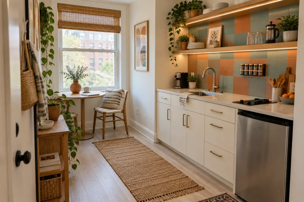
Large terracotta and soft teal squares turn the backsplash into an easygoing checkerboard behind this compact sink and cooktop. The blocks vary in placement rather than forming a strict alternating pattern, which gives the wall a more relaxed, handmade character. Light oak floating shelves run across the upper wall and introduce a warm border above the color. Their integrated lighting throws a gentle wash over the tile-like surface and the countertop below. White lower cabinets and a pale countertop give the saturated terracotta and muted teal room to stand out, while brass-toned pulls echo the warmth of the orange-brown squares. Plants, pottery, a woven runner, and the bamboo window shade continue the natural, casual palette without adding another competing pattern. The limited backsplash area proves that color blocking can be effective in a small kitchen.
Why it works: The palette balances warm terracotta with cool teal, and the white cabinetry creates a clean visual pause beneath the patterned wall.
- Terracotta square backsplash blocks
- Soft teal square backsplash blocks
- Light oak floating shelves
- Warm shelf lighting
- White cabinetry with brass-toned pulls
Design tip: Limit a small backsplash to two main colors, then use white cabinetry to keep the composition light.
4. Choose Tonal Gray Blocks for Quiet Depth
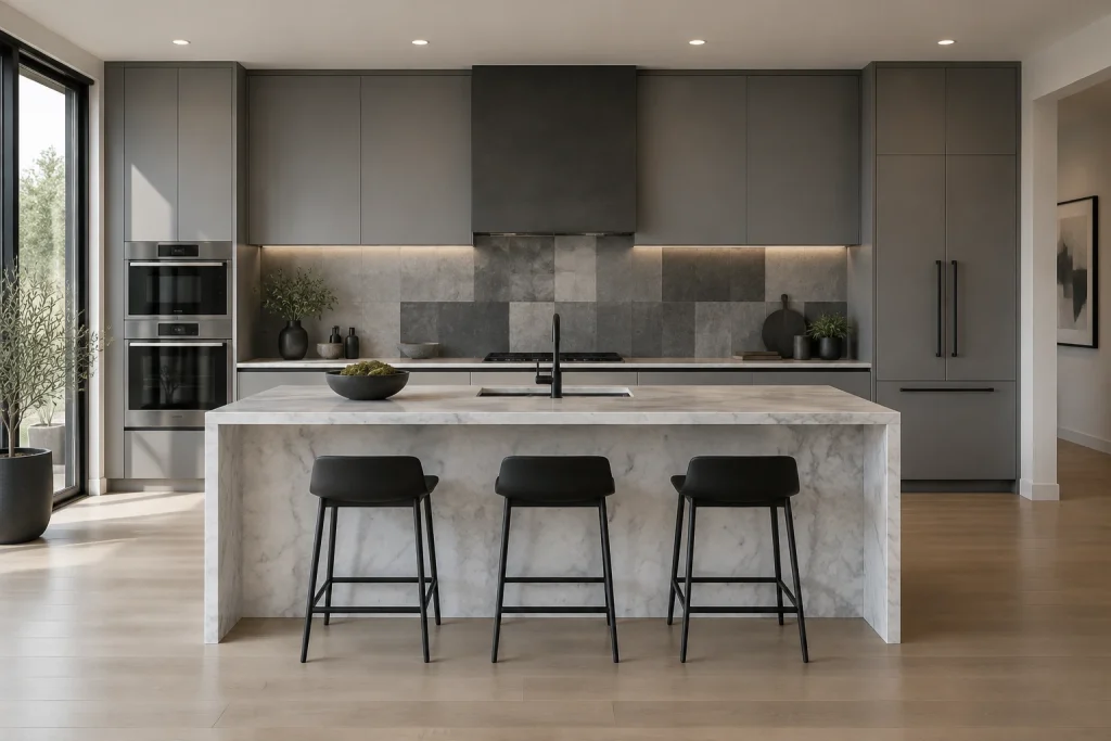
A tonal gray backsplash offers a restrained version of color blocking in this streamlined kitchen. Square and rectangular tiles move from pale gray through mid-gray to charcoal behind the cooktop, creating subtle shifts in depth rather than high contrast. The blocks are concentrated across the working wall, beneath flat-front gray cabinetry and a large charcoal hood, so the pattern reads as part of the architecture. A white-and-gray marble island with waterfall ends introduces a lighter, veined surface in front, preventing the gray palette from feeling flat. Three black stools, the tall black faucet, cabinet pulls, and dark decorative vessels provide crisp punctuation. Under-cabinet lighting emphasizes the tile transitions, while largely clear counters preserve the controlled, minimal effect. This is color blocking for kitchens where texture and tonal variation matter more than a bright palette.
Why it works: Closely related grays supply dimension without breaking the room’s disciplined palette, and the marble island provides contrast through veining rather than another color.
- Light-to-charcoal gray tile blocks
- Charcoal range hood
- Gray flat-front cabinetry
- White-and-gray waterfall marble island
- Three matte-black counter stools
Design tip: Use three to five neighboring shades within one color family, then keep fixtures and seating in one consistent dark finish.
1. Use Primary-Color Stripes to Animate a Breakfast Nook
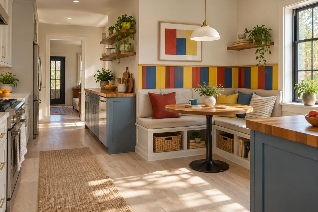
A color-block backsplash kitchen can take a distinctly playful turn with narrow vertical bands of red, blue, and yellow. Here, the striped tile wraps the corner behind a built-in banquette, creating a graphic horizon line above the upholstered seating without overtaking the room. The same three hues reappear in the framed geometric artwork and in the rust, mustard, and blue pillows, giving the bold wall a measured, intentional feel. Cream walls, pale wood flooring, a light wood tabletop, and white bench bases leave the palette plenty of breathing room. Open cubbies beneath the banquette hold woven baskets, books, and a small plant, adding useful-looking texture below the crisp, linear tile pattern.
Why it works: The vertical stripes introduce movement and color at eye level, while the neutral banquette and surrounding surfaces keep the focal wall from feeling visually heavy.
- Vertical red, blue, and yellow backsplash stripes
- Cream upholstered corner banquette
- Round light-wood pedestal table
- Framed geometric artwork in coordinating colors
- Open bench cubbies with woven baskets
Design tip: Repeat backsplash colors in two or three small accents, then keep the larger furnishings neutral.
2. Frame a Seafoam Tile Field With Pale Wood Shelves
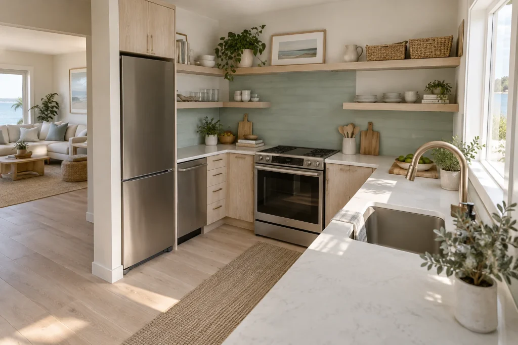
In this compact L-shaped kitchen, a soft seafoam-green tile backsplash forms one continuous block behind the range and along the counter toward the sink. Its muted tone reads as color without disrupting the airy mix of pale wood cabinetry, white countertops, and stainless-steel appliances. Long floating shelves in a bleached-wood finish run across the tiled wall, visually framing the color field while providing a place for stacked white dishes, baskets, framed art, pitchers, and trailing plants. The backsplash is especially effective because it stays contained between the counter and shelving rather than extending into every surrounding surface. Daylight from the large window brightens the counter and brings out the gentle variation in the horizontal tile courses.
Why it works: A single low-contrast color block gives the working wall definition, while pale wood shelves and white serving pieces maintain an open, calm composition.
- Seafoam-green horizontal tile backsplash
- Bleached-wood floating shelves
- Pale wood lower cabinets
- White quartz-look counters
- Stainless-steel range, refrigerator, dishwasher, and sink
Design tip: For a calm color block, choose one muted tile color and style the shelves above it with a restrained mix of light-toned pieces.
Final thoughts
Color blocking can make a kitchen backsplash feel more intentional without requiring every surface to be colorful. Start by choosing the wall or zone that deserves emphasis, then decide whether a crisp split, framed panel, broad stripe, offset grid, or gentle tonal fade best suits the room. Strong hues benefit from grounding elements such as wood, cream cabinetry, black framing, or pale counters, while quieter shades can create depth with a softer effect. When the block edges follow the kitchen’s existing geometry, the finished backsplash reads as part of the design rather than an afterthought.