Two-tone kitchen cabinet ideas offer an easy way to add dimension without making a kitchen feel overdesigned. A darker lower run can ground the room, light uppers can keep it open, and a wood island or tall cabinet wall can introduce contrast in a softer, more material-driven way. The strongest combinations share a clear connection—whether through similar undertones, repeated hardware, or a countertop and backsplash that bridge the two finishes. From classic navy and white to earthy terracotta, walnut, sage, and retro mint, these kitchens show how to make contrasting cabinetry feel intentional, balanced, and personal.
1. Navy Bases and White Shakers With a Wood-Topped Island
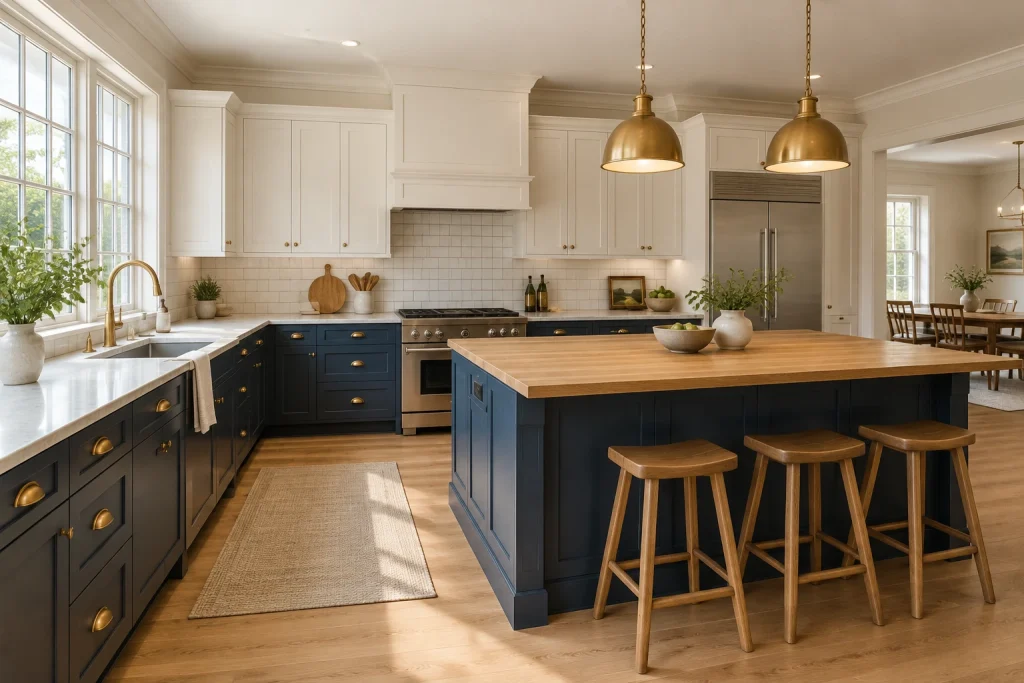
For a classic version of two-tone kitchen cabinet ideas, this kitchen anchors the room with deep navy lower cabinets and lifts the upper half with creamy white Shaker cabinetry. The contrast is structured rather than stark: warm brass cup pulls and knobs repeat across both cabinet colors, while the pale perimeter countertop softens the transition. At center, the navy island is topped in thick, honey-toned wood, tying directly to the three wood stools and plank floor. Two brass dome pendants reinforce that warmth overhead. A generous bank of windows above the sink brings daylight across the light counter and highlights the deliberately open floor area around the island. The result is a kitchen where the darker shade supplies definition without weighing down the cabinetry wall.
Why it works: White uppers preserve visual lightness at eye level, while navy gives the lower cabinets and island a tailored, furniture-like presence. Repeated wood and brass finishes keep the palette cohesive.
- Deep navy Shaker base cabinets
- Creamy white Shaker upper cabinets
- Wood-topped navy island
- Brass cup pulls, knobs, and pendants
- Wood stools and pale wood flooring
Design tip: Use one warm finish, such as oak or brass, across both cabinet colors to make the contrast feel intentional.
2. Matte Black Lowers and White Uppers in a Clean Galley
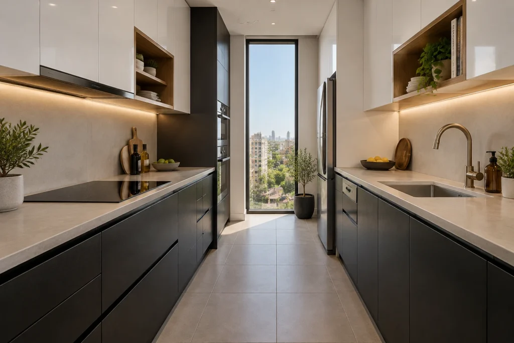
This galley kitchen shows how black-and-white cabinetry can feel calm when the lines are spare. Matte black lower cabinets run along both sides beneath pale, concrete-look counters, creating a grounded horizontal band. Glossy white upper cabinets rise above them and reflect light from the tall window at the far end. The uninterrupted white doors are punctuated by recessed wood niches holding a small edit of dishes, books, and trailing greenery; their wood interiors introduce needed warmth without disrupting the minimal composition. Under-cabinet lighting washes the backsplash and counters, while slim integrated pulls preserve the flat-front look. The clear center aisle, large-format floor tile, and narrow vertical window emphasize the kitchen’s long, orderly proportions rather than making the dark cabinetry feel enclosing.
Why it works: The white cabinetry occupies the visually dominant upper zone, while black stays low and reads as a crisp foundation. Wood niches and warm lighting prevent the palette from becoming overly clinical.
- Matte black flat-front lower cabinets
- Glossy white upper cabinets
- Pale concrete-look counters and backsplash
- Wood-lined open display niches
- Continuous under-cabinet lighting
Design tip: In a narrow kitchen, keep the darker cabinet color below the counter and choose handle-free or slim-pull fronts.
3. Soft Blue Lowers With White Shiplap-Look Uppers
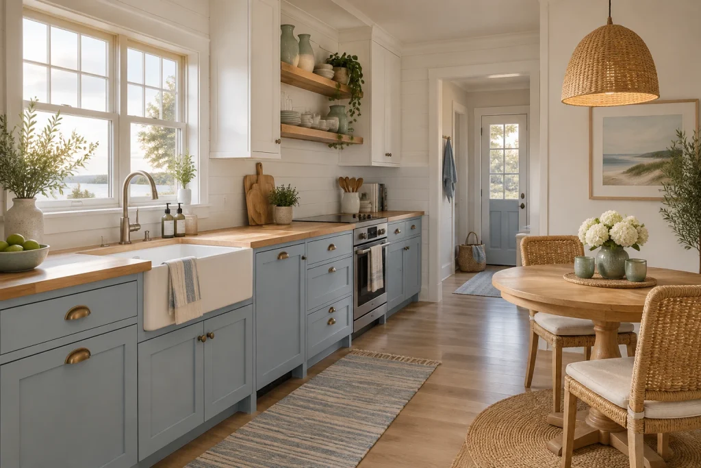
Soft blue base cabinets give this compact kitchen a relaxed coastal direction, while the white upper cabinetry and horizontal wall paneling keep the room bright. The two tones meet at a warm wood countertop that wraps the sink area and continues beneath the cooktop. Brass cup pulls add a gentle gleam against the blue doors, and the white farmhouse-style sink becomes a clean focal point under the window. Rather than filling every upper section with closed cabinetry, two thick wood shelves hold a restrained collection of pale dishes, green glass vessels, and trailing plants. To the right, the same light wood appears on a round pedestal table, paired with woven chairs, a woven pendant, and a natural-fiber rug. The materials make the blue-and-white palette feel layered, not themed.
Why it works: The muted blue is substantial enough to define the working cabinets but soft enough to sit comfortably beside warm wood and white. Open shelves echo the countertop, linking the upper and lower halves.
- Soft blue Shaker-style base cabinets
- White upper cabinets and horizontal wall paneling
- Warm wood countertops and floating shelves
- White farmhouse-style sink
- Woven seating and pendant light
Design tip: Choose a grayed or muted blue for lower cabinets when pairing it with natural wood and white walls.
4. Walnut Lowers and Sage Uppers With Black Accents
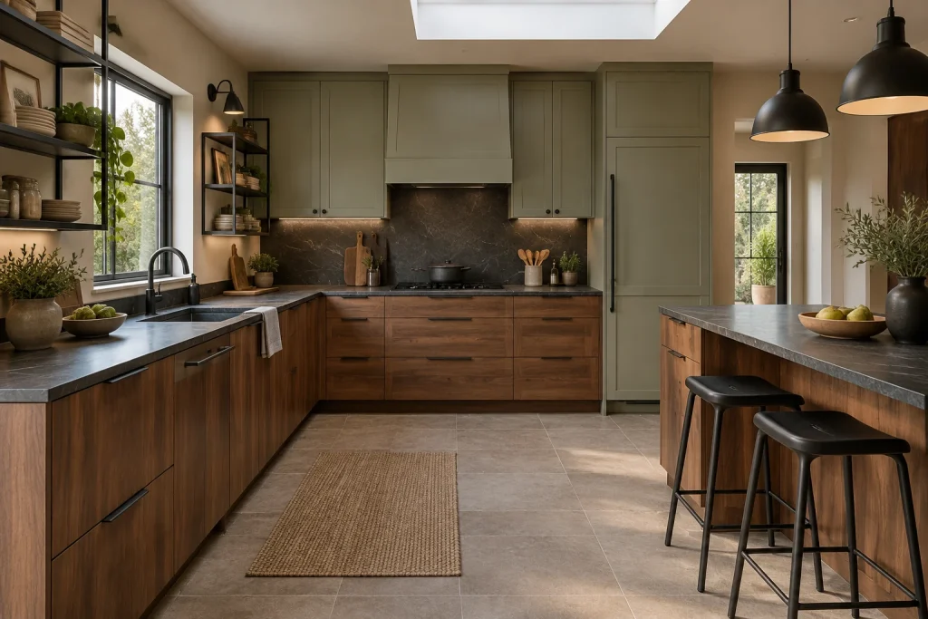
This kitchen takes a more tonal approach to two-tone cabinetry, pairing richly grained walnut lower cabinets with subdued sage-green uppers. The walnut runs across the U-shaped base cabinets and the breakfast counter, so its warmth remains continuous even as the counter projects into the room. Above the cooktop, sage doors frame a dark, veined stone backsplash and matching counter, creating a quiet center of contrast. Matte black details sharpen the softer palette: long cabinet pulls, a gooseneck faucet, metal-framed open shelves, wall sconces, and two large pendant lights. The open shelves are styled with stacked ceramics, glass jars, framed art, and plants, yet retain visible breathing room. A skylight and side windows bring natural light onto the dark counter surfaces, textured runner, and pale tiled floor.
Why it works: Walnut supplies depth at the base, while sage softens the upper cabinetry without the high contrast of bright white. Black metal details provide a clear graphic thread between the two finishes.
- Walnut veneer lower cabinets
- Sage-green upper cabinets
- Dark veined stone counters and backsplash
- Matte black pulls, faucet, shelving, and pendants
- Black breakfast stools
Design tip: Pair walnut and sage with a dark counter or backsplash to create a deliberate bridge between warm wood and muted paint.
1. Ground Botanical Greens With a Paler Tall Cabinet
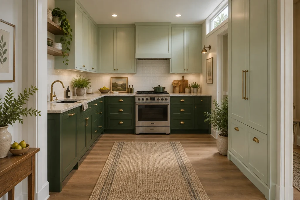
Among the most composed two-tone kitchen cabinet ideas, this pairing lets the darkest color carry the working zone. Deep forest-green lower cabinets wrap the range wall and continue around the sink, while pale mint cabinetry rises above the counter and covers the tall cabinet wall at right. The split feels intentional because both hues share a muted, botanical cast rather than competing undertones. Brass pulls, knobs, and cup pulls add a fine warm line across the painted fronts, echoed by the brass faucet and wall sconce. A pale stone-look counter, creamy square-tile backsplash, and warm wood floor keep the greens from becoming heavy. The runner establishes a soft central lane while leaving the cabinet colors visually uninterrupted.
Why it works: Dark lower cabinets create visual weight at floor level; the lighter upper and full-height cabinets reflect more of the window light and keep the narrow room from reading as top-heavy.
- Forest-green shaker lower cabinets
- Pale mint upper and tall cabinets
- Brass cup pulls, knobs, and faucet
- Pale stone-look countertop
- Cream square-tile backsplash
Design tip: Choose two greens with similar gray or muted undertones, then repeat one warm metal across the hardware and faucet.
2. Make the Island the Wood-Tone Counterpoint
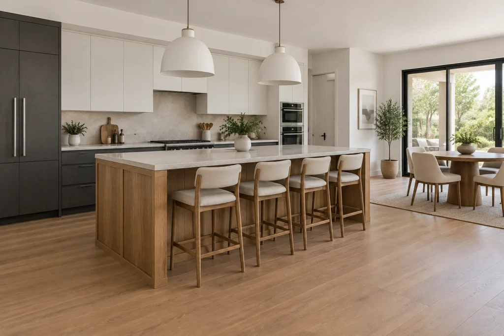
This kitchen uses a different kind of two-tone move: the warm oak island is the color break, set against charcoal perimeter lowers and a long field of white upper cabinets. Its paneled wood base and pale waterfall-like counter edge give the island enough presence to anchor the open room without adding another paint color. Four upholstered wood stools line the overhang, and two large white dome pendants identify the island as the social center. Behind it, the dark refrigerator surround and lower drawers create a strong horizontal base, while the white wall cabinets recede into the light walls and ceiling. The pale flooring and pale counter surfaces connect the kitchen to the adjacent dining area, where a wood table repeats the island’s warmer note.
Why it works: The dark-and-light perimeter establishes a clean backdrop, allowing the oak island to supply warmth, contrast, and furniture-like character in one move.
- Warm oak-paneled island
- Charcoal lower cabinets and refrigerator surround
- White flat-front upper cabinets
- Four upholstered counter stools
- Oversized white dome pendants
Design tip: When using a wood island, repeat its tone in nearby seating or a dining table rather than introducing another wood finish.
3. Lean Into Retro Contrast With Mint and Cream
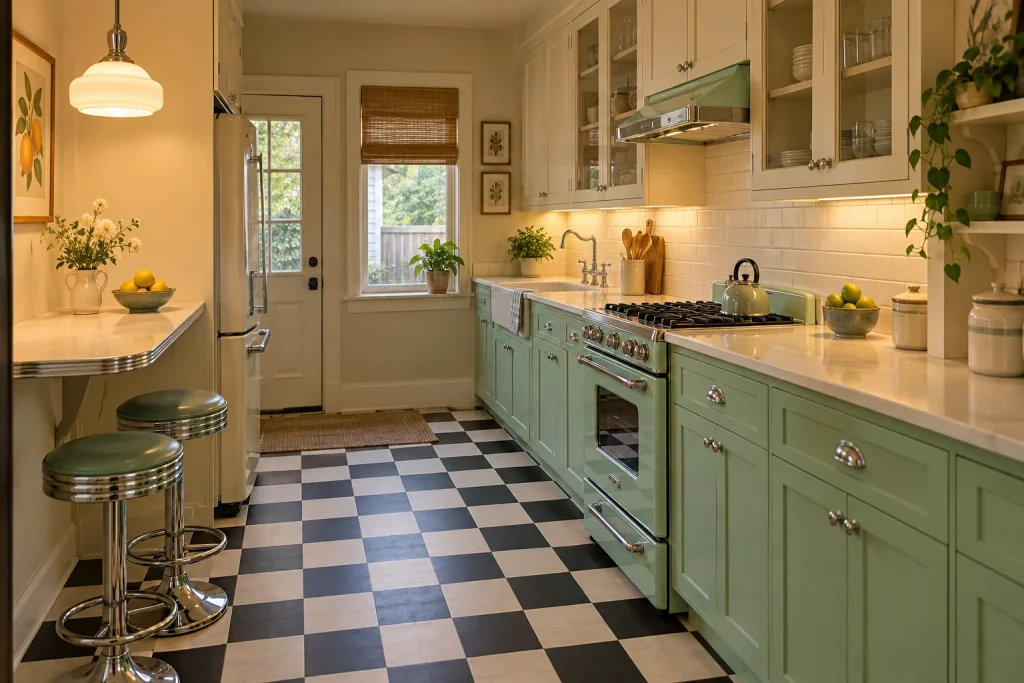
Soft mint base cabinets and warm cream uppers create a cheerful period-inspired scheme without relying on color alone. The mint range, lower drawers, and cabinet doors form a continuous band along the right wall, while cream upper cabinets—with several glass-front doors—lighten the room above. Chrome is the unifying detail: it appears on the range trim and controls, cabinet hardware, stools, and the edge of the compact eating ledge. Under-cabinet lighting warms the cream subway tile and glossy pale counters, while the black-and-white checkerboard floor supplies the strongest graphic contrast. A mint kettle and bowls of citrus reinforce the palette in small doses. The result is lively, but the cabinet division remains simple and easy to read from one end of the galley to the other.
Why it works: Keeping the darker, more saturated mint below eye level lets the cream upper cabinets maintain brightness, while chrome and the checkerboard floor make the retro references feel cohesive.
- Mint lower cabinets and matching range
- Cream glass-front upper cabinets
- Black-and-white checkerboard floor
- Chrome stools and cabinet hardware
- Cream subway-tile backsplash
Design tip: Use one saturated cabinet color below the counter, then keep uppers warm white or cream to preserve visual breathing room.
4. Use Charcoal Lowers to Sharpen a Small Galley
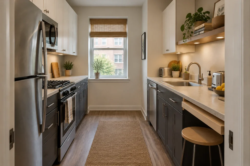
In this narrow galley, charcoal lower cabinets make a crisp base beneath soft white upper cabinets. The contrast is especially effective because the counters, walls, and upper fronts stay close in value, creating a calmer top half around the window. Slim brushed-metal bar pulls coordinate with the stainless refrigerator, range, dishwasher, sink, and faucet, so the darker cabinet color does not feel isolated. On the right, an open wood shelf introduces a warmer material above the counter, while the shallow wood breakfast ledge and single round stool add a practical place to perch without filling the walkway. The charcoal lowers continue on both sides of the kitchen, visually linking the two runs. A woven runner adds texture along the open floor rather than another competing pattern.
Why it works: A dark, continuous lower-cabinet band defines both sides of the galley, while light upper cabinets and the end window keep the eye moving through the compact space.
- Charcoal lower cabinet fronts
- Soft white upper cabinets
- Brushed-metal bar pulls
- Wood breakfast ledge with round stool
- Open wood shelf with under-shelf lights
Design tip: For a small galley, keep the upper cabinets and wall color close in tone, then reserve the strongest contrast for the lower fronts.
1. Ground a Light Kitchen With a Black Storage Wall
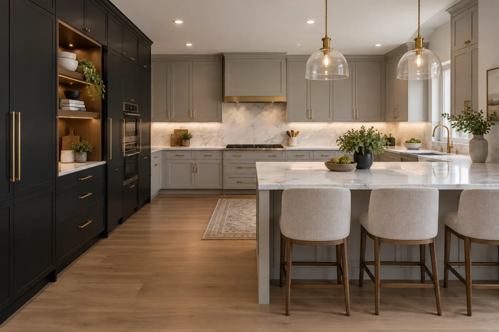
Among two-tone kitchen cabinet ideas, this composition makes the darkest finish feel intentional by concentrating it on one full-height cabinet wall. The matte-black cabinetry at left frames a lit open niche and stacked built-in ovens, while the remaining cabinets shift to a soft gray that keeps the long cooking wall visually open. Slim brass pulls repeat across both finishes, creating a consistent line rather than a hard divide. White marble runs across the backsplash and the large peninsula, where its gray veining ties into the perimeter cabinetry. Clear-glass pendants with brass fittings and pale upholstered stools soften the strong contrast without competing with it. The result is a tailored balance of dark architectural storage and lighter working surfaces.
Why it works: Keeping black to a single tall volume gives it presence, while gray cabinets, marble, and glass prevent the room from reading heavy.
- Matte-black full-height cabinetry
- Soft-gray Shaker-style cabinets
- Brass pulls and faucet
- White marble backsplash and peninsula
- Clear-glass pendant lights
Design tip: Use one hardware finish across both cabinet colors to make the pairing feel cohesive.
2. Pair Terracotta Lowers With Warm Wood Uppers
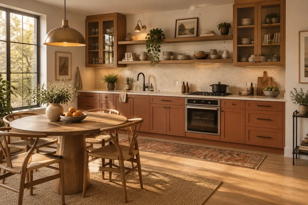
This kitchen takes a softer route to two-tone cabinetry by using terracotta-painted base cabinets beneath natural-wood upper storage. The earthy lower run is detailed with recessed panel fronts and slim black pulls, then topped with a light cream counter and matching backsplash. Above, two glass-front wood cabinets flank long open shelves, so the upper wall feels layered rather than solid. Stacks of neutral dishes, pottery, books, and trailing greenery bring varied texture to the shelves while leaving generous stretches of wall visible. A black faucet and black range details sharpen the otherwise warm palette. In the foreground, the round wood table, woven-seat chairs, and rust-toned rug echo the cabinetry’s warmth, making the kitchen and dining area read as one connected space.
Why it works: Terracotta carries visual weight at the base, while wood-and-glass upper storage maintains warmth without closing in the wall.
- Terracotta recessed-panel base cabinets
- Natural-wood glass-front upper cabinets
- Long open wood shelves
- Cream countertop and backsplash
- Matte-black pulls and faucet
Design tip: Keep open shelving to a restrained palette of everyday ceramics and a few plants for a calm, useful display.
Final thoughts
The most successful two-tone kitchens use contrast with purpose. Choose one finish to anchor the room and let the second brighten, soften, or define a particular zone, such as the island, upper cabinets, or a full-height storage wall. Then repeat a few unifying elements—warm wood, brass or black hardware, a continuous countertop, or a consistent backsplash—to make the palette feel cohesive. Whether the look is crisp black and white or layered in botanical greens and walnut, two cabinet tones can bring both structure and warmth to the kitchen.