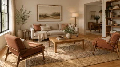
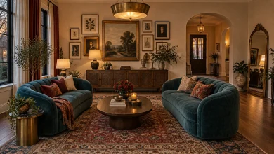
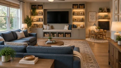
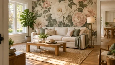
Gallery walls can add character, but a grid of frames is only one way to make a living room wall feel complete. For a quieter, more dimensional approach, shift the focus to layered art on a console, a slim picture ledge, built-in niches, textiles, or a display that begins at floor level. These living-room-gallery-wall-alternatives show how practical elements such as shelving, mantels, and bookcases can double as a focal point, while mirrors, patterned tile, and sculptural objects bring visual interest without relying on a conventional frame arrangement.
1. Lean Oversized Art on a Low Console
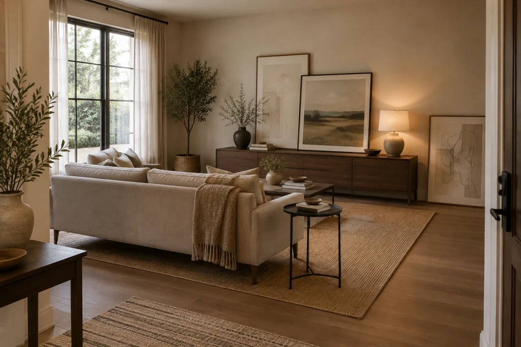
For a softer alternative to a conventional gallery wall, this living room uses scale and layering rather than a grid of frames. Two large framed artworks rest on the long dark-wood console, while a third, narrower piece leans directly on the floor at the right. Their pale, restrained imagery keeps the arrangement quiet against the warm wall, and the black frame edges add definition without breaking the tonal palette. A matte black vase with branches, a small stack of books, a shallow bowl, and a table lamp turn the console into a composed surface rather than a storage-only piece. The layered frames feel intentional because their heights step down gradually across the wall.
Why it works: Oversized pieces make a clear focal point with fewer visual interruptions than many small frames. Leaning the art also introduces depth, while the console grounds the grouping at a useful, human scale.
- Dark wood low console
- Three oversized leaning framed artworks
- Matte black vase with branches
- Warm table lamp
- Neutral woven area rug
Design tip: Use frames of noticeably different heights, then overlap them slightly for a relaxed composition.
2. Create One Long Picture Ledge Above the Sofa
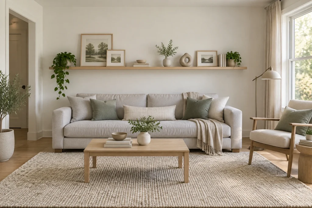
A single pale-oak picture ledge provides a clean, flexible display line above the sofa. Rather than filling the wall, the arrangement leaves generous blank space overhead and between each object. Small landscape prints in light wood frames alternate with a trailing plant, a low bowl set on books, a rounded vase of branches, a pierced sculptural form, and another small plant. The mix stays cohesive because the objects share quiet, natural tones: soft beige, muted green, pale wood, and off-white ceramic. Below, the light sofa and simple wood coffee table repeat that edited approach. This is one of the most practical living-room-gallery-wall-alternatives for anyone who wants to refresh art and objects without continually making new wall holes.
Why it works: The continuous ledge supplies structure, while the varied heights and silhouettes keep a long horizontal line from feeling flat. Open wall space makes the collected pieces read as a focused composition.
- Continuous pale-oak floating ledge
- Light wood framed landscape prints
- Ceramic vase and sculptural object
- Trailing and potted greenery
- Soft gray-green pillows
Design tip: Keep the tallest objects near the center or in balanced clusters, and leave visible stretches of ledge between groupings.
3. Use Lighted Niches for a Built-In Display
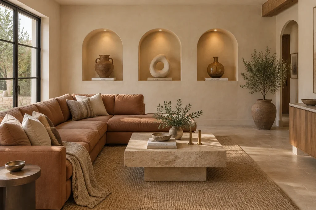
Three arched niches turn the plaster feature wall into its own sculptural backdrop. Each recess is lit from above and holds a deliberately spare pairing: one object elevated on a single book. The left niche contains a handled earthenware vessel, the center presents a pale looped sculpture, and the right holds a round brown vessel. Their earthy finishes echo the caramel sectional, stone coffee table, woven rug, and large floor vessel nearby, so the display feels integrated with the room rather than applied to it. The repeated arches create a strong rhythm, yet the individual objects prevent the wall from becoming overly uniform. In place of a collage of frames, the wall itself provides dimension, shadow, and display space.
Why it works: Recessed alcoves add architectural depth that flat wall art cannot provide. Focused lighting isolates each vignette, and the repeated forms bring order to varied handmade-looking objects.
- Three arched recessed niches
- Warm recessed spotlights
- Earthenware vessels
- Pale pierced sculptural form
- Single books beneath each object
Design tip: Limit each niche to one main object and one low support piece so the recessed shape remains visible.
4. Hang Textiles in Layers for Color and Texture
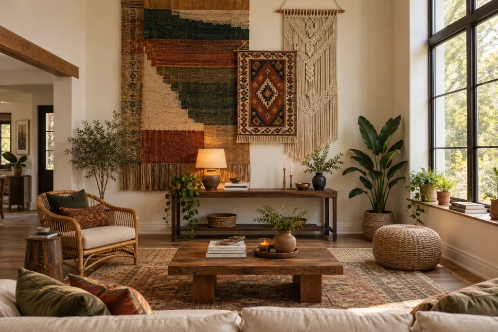
Textile hangings offer a highly tactile answer to framed art, especially on a tall wall. Here, a large woven panel establishes the backdrop with blocks of ochre, deep green, rust, and natural beige. A smaller patterned kilim overlaps its lower right area, while a cream macramé hanging on a wood rod occupies the adjacent wall plane. The different materials bring distinct texture—dense weave, fringe, and open knotted cord—without relying on matching frames. Beneath them, a narrow dark-wood console carries a lamp, candlesticks, books, bowls, and vessels, extending the warm, collected mood downward. A rattan chair, woven pouf, plants, and patterned rug reinforce the handmade character while the tall windows keep the wall display brightly outlined.
Why it works: Layering textiles adds vertical presence and softness at the same time. The varied formats create a composed focal area, while the shared rust, green, cream, and brown tones connect the pieces.
- Large geometric woven wall textile
- Patterned fringed kilim
- Cream macramé hanging on a wood rod
- Narrow dark wood console
- Rattan chair and woven pouf
Design tip: Build from one large textile first, then add smaller hangings with enough separation that each pattern and fringe can be seen.
1. Make a Full-Height Bookcase the Artful Focal Point
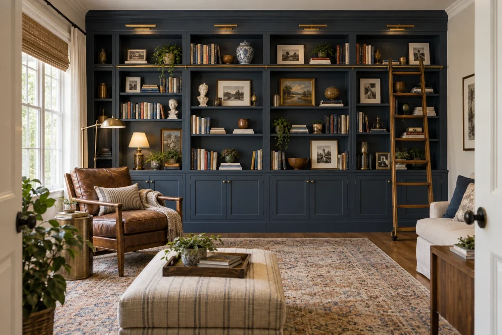
For a living-room-gallery-wall-alternatives approach with real presence, this deep navy shelving wall turns storage into a layered display. Books stand both vertically and horizontally among framed landscapes and portraits, ceramic vessels, busts, brass-toned objects, and trailing plants. The arrangement is deliberately uneven: some cubbies hold one large framed piece or vessel, while others carry compact book groupings. Slim picture lights across the top bring a warm line of illumination to the dark finish. Below, paneled cabinets create a quieter base, while a wood library ladder adds vertical punctuation at the right. A cognac leather chair, brass floor lamp, patterned rug, and striped ottoman establish a reading-centered seating area in front.
Why it works: The bookcase supplies the visual rhythm usually created by a gallery wall, but its recessed compartments give every object a defined boundary. Dark paint increases contrast around lighter paper, ceramics, and brass, helping a varied collection read as one composition.
- Deep navy floor-to-ceiling shelving
- Mixed books, framed art, and sculptural objects
- Brass picture lights and cabinet knobs
- Wood rolling library ladder
- Paneled lower cabinets
Design tip: Leave several shelf sections partly open so the display retains contrast and depth.
2. Replace Wall Art With a Low Pedestal Vignette
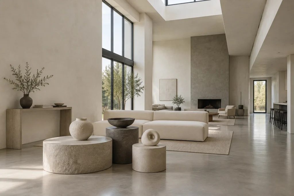
Instead of filling the expansive plaster wall, this room places the focal composition on the floor: three low, rounded pedestals in light and dark stone-like finishes. Their different diameters and heights create a compact landscape, topped with a large pale vessel, a dark shallow bowl, and a small ring-shaped sculpture. A narrow stone-toned console nearby holds a dark vase with branches, a short stack of books, and another shallow bowl, extending the same restrained vocabulary without competing with the cluster. The pale, low-profile sectional behind the pedestals keeps sightlines open toward the tall windows and fireplace wall. Daylight from the large glazed opening and overhead skylight emphasizes the matte surfaces, curved forms, and quiet shifts of off-white and gray.
Why it works: The vignette introduces silhouette, scale, and material contrast without asking one wall to carry the entire room. Keeping the display below sofa-back height preserves the airy view through the open space.
- Three rounded low pedestals
- Oversized textured vessel
- Dark shallow bowl
- Ring-shaped sculptural object
- Stone-toned console with branch arrangement
Design tip: Use three pedestals of distinct heights, then limit each top to one object.
3. Compose a Wall With Mirrors and a Brass Screen
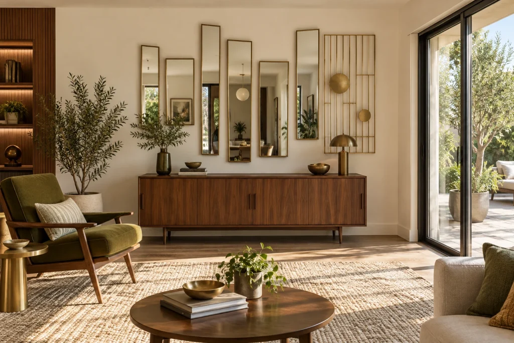
This mid-century-leaning alternative trades framed art for five slender, brass-edged mirrors arranged at varied heights above a walnut credenza. The vertical panels reflect greenery, furnishings, and a globe pendant, giving the cream wall movement without adding color or a conventional picture grouping. At the right, a tall brass grid screen with circular discs introduces a contrasting linear layer; its warm finish echoes the mirrors and the small brass table lamp below. The credenza is styled sparingly with a dark green vase of leafy branches, stacked books, and two small bowls. An olive upholstered wood-frame lounge chair faces into the room, while the black-framed sliding doors at right bring strong daylight and outdoor foliage into the composition.
Why it works: The mirrors form an asymmetrical grouping, yet their shared narrow proportions and brass borders make it cohesive. Reflections repeat light and greenery, while the screen adds texture without covering the wall in imagery.
- Five slim brass-framed mirrors
- Brass grid screen with circular discs
- Low walnut credenza
- Olive lounge chair with wood frame
- Black-framed sliding glass doors
Design tip: Keep mirror frames consistent, then vary panel heights and spacing for an intentional asymmetrical arrangement.
4. Let a Patterned Tile Wall Do the Decorating
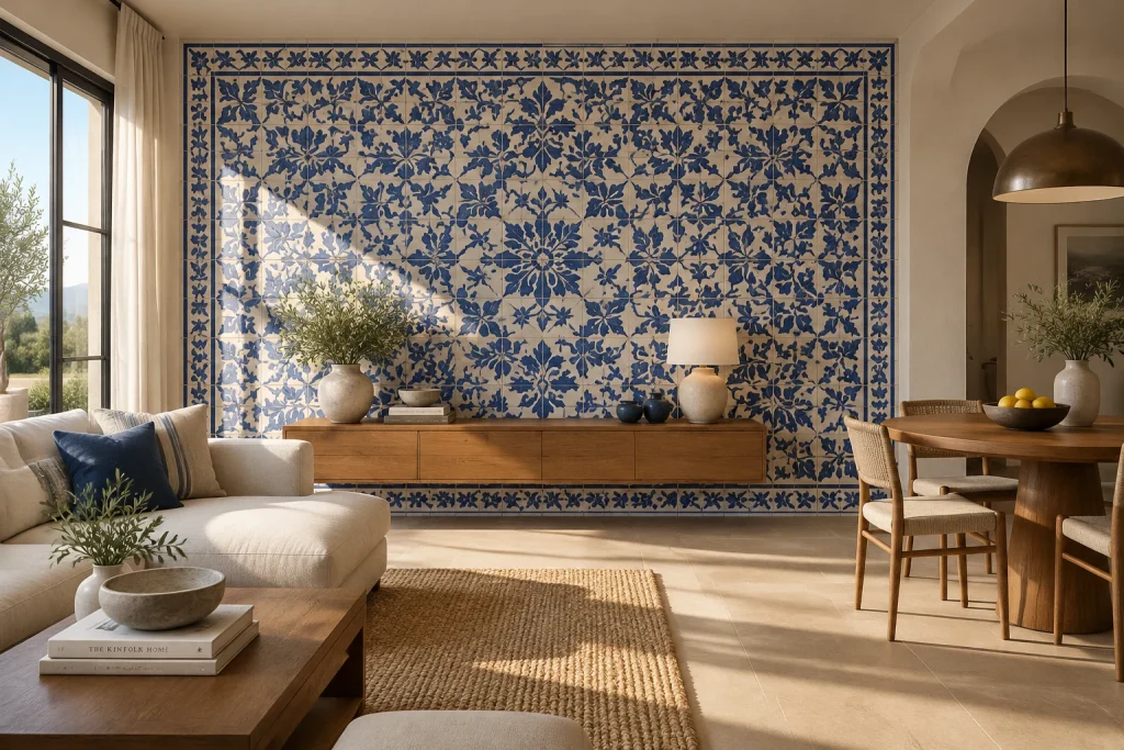
A full field of cream and cobalt blue tile gives this living and dining space a decorative wall that needs no gallery arrangement. The tiles create a dense botanical pattern across the central expanse, finished with a distinct blue floral border on all four sides. A long, low wood console floats in front of the mural, but its simple horizontal shape leaves the tilework visibly dominant. On top, a pair of pale ceramic vases with leafy branches, stacked books, a bowl, two dark blue vessels, and a lamp are spaced across the surface rather than clustered tightly. At left, the cream sectional repeats the wall’s pale ground with blue and striped pillows; at right, a round wood dining table and woven chairs continue the natural material palette.
Why it works: The tile installation has built-in repetition, color, and a clear perimeter, so it reads as a complete composition rather than a backdrop awaiting art. The restrained console styling preserves the patterned field as the room’s primary visual event.
- Cobalt blue and cream botanical tile field
- Bordered tile frame
- Floating wood console
- Pale ceramic vessels with branches
- Round wood dining table and woven chairs
Design tip: When using a bold tiled wall, keep objects on the console low and widely spaced.
1. Build a Rotating Display on a Pegboard
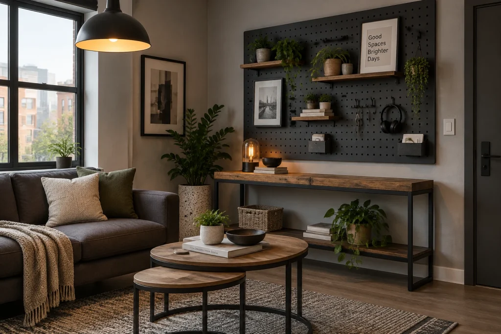
A charcoal pegboard turns the wall above the slim wood-and-black-metal console into a flexible alternative to a conventional gallery wall. Two wood shelves carry potted plants, while small framed prints sit directly against the perforated surface. Hooks introduce a more practical layer, holding headphones and a few narrow tools; two small black wall bins hold papers or cards. The arrangement feels composed rather than crowded because the larger pieces are distributed across the board: a white typographic print occupies the upper center, a black-and-white image anchors the left, and greenery softens both shelf lines. Below, the console repeats the wood-and-black palette and leaves its open lower shelf visible. A small lamp with an exposed filament adds a warm pool of light against the dark panel.
Why it works: The grid gives disparate objects a shared structure, so plants, frames, hooks, and storage read as one graphic composition instead of unrelated wall clutter.
- Charcoal perforated pegboard
- Wood shelves with black brackets
- Small framed art and a typographic print
- Hooks, headphones, and wall-mounted bins
- Wood-and-black-metal console
Design tip: Start with two shelves, then add hooks and small art in the open spaces.
2. Use the Mantel as a Layered Focal Point
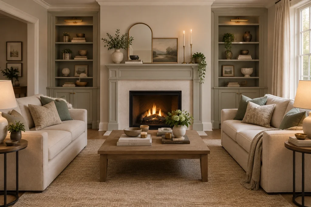
Instead of filling the fireplace wall with multiple frames, this room uses a single layered mantel vignette to draw the eye upward. A tall arched mirror in a warm metal frame rises from the center, with a landscape painting overlapping its lower right edge. At left, a rounded ceramic vase filled with leafy branches sits on a short stack of books; at right, two slender brass candlesticks and a trailing plant balance the grouping. The mantel’s pale painted surround and stone fireplace face keep the styling quiet against the built-in sage shelving on either side. Those shelves continue the same restrained vocabulary with books, bowls, pottery, plants, and small framed pictures. On the coffee table, low stacks of books, bowls, candles, and a white vase echo the layered approach at a lower level.
Why it works: The mirror provides one strong vertical form, while overlapping art, books, ceramics, and candleholders create depth without the rigid repetition of a gallery wall.
- Arched mirror with a warm metal frame
- Leaning landscape painting
- Ceramic vase with leafy branches
- Brass candlesticks
- Sage built-in shelves with books and pottery
Design tip: Choose one tall anchor, then layer one smaller artwork partly in front of it.
Final thoughts
The strongest alternative to a gallery wall is one that suits the room’s architecture and the way you live in it. A picture ledge or pegboard makes change easy, while niches, tile, and full-height shelving create a more permanent statement. If you prefer a restrained look, lean a few oversized pieces or build a low sculptural vignette instead. Keep the palette connected to nearby furniture and leave enough open space around the display so each object, artwork, or material has room to register.